
Every time you make a Power BI report, there’s a million things you need to remember to do both as you go along and when you launch it. PARTICULARLY if you’re trying to follow best practices, it can be a lot to remember.
What I like to do is make a checklist for this, and I’m going to give you every single one of the items on the checklist I use. We’re going to start with why you should do this, how to structure it to make it twice as useful, then the checklist items by category, and at the end a couple of ways to make it successful in a “real world” sense.
Pick a tool to track it
This comes first because when you build this you want to build it in a good place so you don’t have to redo it later. 🙂
I personally use a Microsoft List (a.k.a. SharePoint list) for this, preferably a single list for everyone who is creating Power BI reports in an organization to share so that all the data is in one place, but you could use Excel if you don’t want to go there. Here’s a YouTube tutorial on how to set up a Power BI best practice checklist in Microsoft Lists if you’d like one of your own!
If you’re using SharePoint, you can use the description attribute of columns to add descriptive text under each field to give more detail.
Make the checklists actual records – here’s why
The idea here is that you are being smart about this – you are logging your adherence to best practices in an actual record. You are not scanning down a list of bullet points on a page and asking yourself whether or not you did all the things listed, because… as a data person, this is some data that can benefit you!
You can USE this data in creative ways to help yourself and your team. So for instance, if you or your team is being pressured to provide KPIs, a very meaningful KPI would be the percentage of your reports or your team’s reports that follow best practices, which can be validated via records like this in conjunction with data available in the Power BI Admin API.
The advantage of a structured list like this vs Excel is that you have actual records and you can trigger automation on those, like notifications or approvals – potentially leading to a certification process that you use to label a dataset or report as “certified” in your organization. If this sounds like too much work, don’t worry – you don’t have to have it all from the get-go, but it’s nice to have the option later if you want to!
The checklist makes a really convenient way to track other information related to the report in a sortable, filterable view, too. For example, what data domain is it, who the target audience is, whether it’s a business-critical report or not. That kind of thing is really useful to have as a reference.
What should go in the checklist?
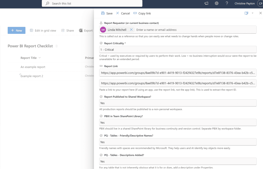
Information about the report
You’ll notice these look really similar to field s you’d see in a request form. That’s cool, you could use this as a request form actually, if you don’t already have one elsewhere. It would streamline things quite nicely.
- Report Status (choice field type), e.g. “In Development”, “Launched”, “Deprecated”, “Deleted”
- Report Owner (person or group field type) – this is the person who manages updates to the report
- Primary Report Contact (person or group field type)
- Yes, this information is something you can flag in the report settings – but you can’t report on that anywhere. It’s not in the PBI Admin API, there’s no reports on it in the PBI admin center. If you want to be able to pull up a list of what needs to be handed over when a report contact leaves, you have no easy way to get that from Power BI, so it’s a good idea to track it yourself.
- Original Requestor of a report (person or group field type)
- This is usually the same as the contact, but not always
- Report Criticality (something like choice options of “1 – Critical, 2 – Standard, 3 – Low”). The numbers in the choice values let you sort it easily in the list.
- Report Link (hyperlink field type) – this is dual purpose, it both gives you a clickable link in the list to a published report AND you can split the report ID off the end of it, which is very useful to be able to link this back to other data about your report. Obviously this should be an optional field, since you won’t have a report link until the end of the process.
- If you have dev, test, and prod versions of the report or dataset, you might want multiple fields here
Checklist items – the essentials
I make these choice dropdowns, with values of Yes/No/Not Applicable and make them optional so that getting the initial entry in the tracking form isn’t a total pita. I want to point out that this checklist in its entirety is very long because I wanted it to be comprehensive. It’s reasonable to pick the parts that are most applicable to you if it’s too much and feels overwhelming.
- Published to shared workspace?
- Personal workspaces should only be used for temporary reports, they are deleted with your account if you leave your organization. Make sure at least one other person has owner access to the workspace so that they can support things if you’re MIA.
- Viewer access granted?
- … it’s easy to forget this step, that is all
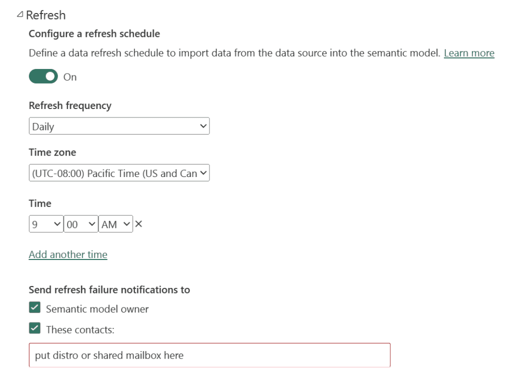
- Refresh scheduled?
- Beyond the yes/no here, consider whether you have intentionally specified a refresh time, because the default is midnight and you do not want all datasets in your org refreshing in the same timeslot (it can lead to resource issues and more failures).
- Also think carefully about your refresh frequency – if the database you’re connecting to only gets fresh data once per day, scheduling your Power BI refresh for twice a day is not helpful.
- Alternate refresh contact set?
- That’s this one in the scheduled refresh settings; the idea being if you’re out on vacation or leave your org, you want someone else to know if/when the refresh fails:
- Report numbers validated (or QA done)?
- Make sure the numbers coming out of your report make sense. Everyone makes mistakes, even things like accidentally using a > sign instead of < in a measure can result in totally bogus outputs and be really embarrassing if you don’t catch it early. The CFO will be the first person to notice if you make a mistake, because that’s how these things go.
- PBIX in team SharePoint library?
- This is a business continuity thing. Your team should have your PBIX files if you depart suddenly, and not all PBIX can be downloaded from the Power BI web app in certain circumstances so it’s best to just store them in a shared location. This also gives you version control for your PBIX. If you sync it locally and just make a routine of storing all your working files in there, it’s pretty convenient. Do not put it in OneDrive, your OneDrive is deleted if you leave your org.
- Service account or service principal for refresh?
- Data refreshes run using the credentials/permission of the dataset owner. The gateway uses service account permissions, but still uses the gateway connection permissions of the model owner when it refreshes, so even if you’re using a gateway if you leave your org your refresh will fail unless you are using a service account or service principle to run the refresh (if you decide not to do this, make sure someone else takes over your datasets if you leave your org before your last day)
- Documentation available for viewers?
- Provide information about where your data is coming from and what the business rules are for it in a place that your viewers can get to. This can be a hyperlink to documentation, an info tab, info icons with hover tooltips, a good report description – whatever you like, as long as it’s accessible. This leads to less “BuT WHerE do the NUMBERZ CoME frOOOM??” questions later, and may give context for number “discrepancies”.
Power Query/DAX/modeling
- Data tables have friendly/descriptive names?
- It’s good to do this for columns too, but at a minimum do it for the tables
- Data tables have descriptions?
- This is in the right-click menu for the table under “properties”; it helps in the future for someone unfamiliar looking at the report to know what the table is
- Date table used?
- Also called a calendar table, these are VERY useful for working with fiscal periods and relative dates, but once you start using them you’ll find yourself using them for every report most likely
- Power Query: Foldable steps first?
- The first non-foldable step in a query breaks query folding and will make your query take longer / be more prone to failure, thus put all of the foldable steps first if you can
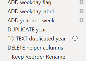
- Power Query: Readable step names?
- I picked up this technique from the awesome Brian Grant. This is an example from his date table that I added a few bits onto, you can see how it really adds clarity:
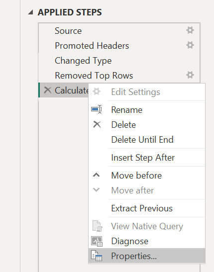
- Power Query: Step comments added?
- This doesn’t need to be every single step, but it’s useful for the more important ones, weird joins, and anything not self-explanatory. You can add a comment by right-clicking the step and going to “properties” or using “//” in the advanced editor.
- Unused columns or rows removed?
- The extra 30+ columns you’re not using on your source tables can really explode your model size. If, as your first step you select the columns you actually need and right click -> remove other columns, that step will fold in most sources, meaning it will only query the things you’re keeping and your refresh time will drastically decrease.
- Do the same thing for any rows you don’t need, that will also fold (e.g. do you really need your report data to go back to 2007?)
- DAX measures/columns commented?
- Any DAX measure that is longer than a couple lines, has weird filters, or wouldn’t make sense to your teammate with no context should have commentary added. You can do this by typing “//” and then your notes.
- A particularly useful thing to do here is to note any business logic applied, if that information is not readily available elsewhere (IN WRITING… not in Debbie’s who’s been around 15 years’ head).
- Used KEEPFILTERS(column to filter) instead of FILTER(table, column value = “foo”) in CALCULATE?
- This is one of the #1 DAX changes you can make to optimize query speed.
- Used CROSSFILTER() instead of model-level bidirectional relationships where appropriate?
- CROSSFILTER() can be used to force bidirectionality (or any direction) at the measure level, instead of at the model-level, which can help speed and performance. You’ll see this often where you are trying to filter a header-level table by a line-level column (like invoices by the product, where product is on the line item table). If you need the bidirectional relationship for a lot of things, it can be appropriate to have it enabled select places, but if you only need it for a a small number of things, use CROSSFILTER().
- Tabular Editor: Pushed measures text to description?
- Reid Havens has a great video on this here. Essentially, if you’re using a semantic model with multiple reports, you can no longer see what measures do when you select them in the report editor. This technique allows you to push the DAX used in your measures to the measure description property with Tabular Editor, so that when you hover on them you can see what they’re doing. The code block you want is: foreach (var m in Model.AllMeasures) { m.Description = m.Expression; }
- Tabular Editor: Measures formatted?
- Formatting measures for readability is best practice for sure, but it can be a little tedious. You can format all your measures at once with Tabular Editor, though! Here’s the code block: foreach (var m in Model.AllMeasures) { m.Expression = FormatDax(m.Expression); }
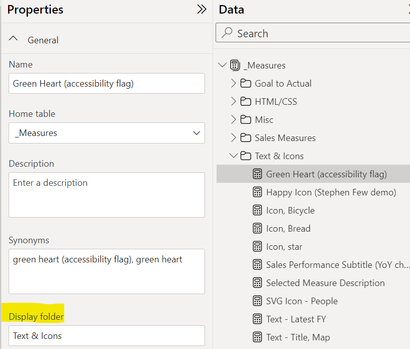
- Model View: Measures organized?
- Obviously this is only necessary if you have a lot of measures. You can add folders in the model view tab by typing a name in the folder. Once your folder exists, you can drag and drop multiple at a time into the folder just like you would files (but you have to be in model view to move multiple). You might also opt to put them in their own “Measures” table (which you can sort to the top of the table list by prefixing with an underscore).
- Model View: Unneeded fields hidden?
- It’s considered best practice to hide fields you won’t use, including the column on the “many” side of any “1:many” relationships to avoid confusion for anyone other than you viewing the model (and for the Q&A feature)
- Unused custom visuals removed?
- It’s common to to see custom visuals imported to a report from App Source to “try them out” – always remove them if you don’t end up using them from the visuals pane menu, not just from the page. And, if you don’t actually need custom visuals, don’t use them! Non-certified visuals can be a security risk. Certified visuals, e.g. Deneb, are usually fine depending on org policies.
Design & Accessibility
- Branding – Organizational theme or template used?
- Most orgs start with a free-for-all on report design, then eventually realize that it feels much more coherent and cohesive to use the colors from their marketing brand guidelines and some kind of consistent design
- Number of visuals less than 8 per page?
- This is a loading time thing mostly – Power BI loads visuals in sets of 8 at a time, so if you have more than that it will “thread” them and drastically increase your load time. You can decrease the number of visuals per page using: field parameters, the new card visual (versus the old single-card visual multiple times for multiple metrics), and using sparklines in a table visual instead of placing multiple line charts on a page. Note that shapes and text boxes “count” as visuals in the loading threading.
- Visual “noise” minimized?
- This is an essential design best practice – you want to remove visual distractions to make it easier to focus on the important parts of the data. Not over-using color applies here, but also removing extra decimal places that aren’t needed, formatting your dates cleanly, and putting your detail in a drill or hover rather than having a million values showing in a table at once.
- Sufficient contrast?
- For accessibility/readability – things like yellow font on a white background = bad
- There’s a million web-based tools out there for this if you’re not sure if yours is sufficient, here’s one: https://coolors.co/contrast-checker/112a46-acc8e5
- Necessary screen-reader accommodation done?
- Set the tab order for visuals and alt-text if you have viewers that use screen readers. Meagan Longoria’s blog is a great resource for Power BI accessibility.
- Colorblind-friendly?
- Here’s a good article on colors to avoid (at the very least, red and green should have icons or color density differences): https://davidmathlogic.com/colorblind
- Visuals sorted with intent?
- The sort order inside your visual should help make it easier for your user to read it. E.g. if you show sales by category, it’s usually better to sort by sales amount descending. The default will often be alphabetical.
- Date axis visuals have continuous axis?
- When you’re working with dates on something like a line chart, keeping a continuous axis will dynamically display dates on an interval, and scale the axis if you’re looking at a wide range – keeping your axis from having a scrollbar and/or filling up with 100 label values. This is usually only an issue when you’re using things like week, month, or quarter in the chart – the tendency is for people to use text-type fields for those things, when what you really want is a date type field that is “start of month”, “start of quarter”, and so on, then displaying the field with the format you want it to read with using a column formatting setting. The easiest example to do this with is month, because Power Query will let you transform a date column to a “start of month”, and there’s a format that reads “June 2026” and similar. This is one of those things that may not be obvious when you first publish a report and don’t have much data in the model, but as the years pile on it’ll become more noticeable.
- Header icons disabled for visuals that don’t need them?
- These are the context menus that appear on hover for a visual – not the tooltips, but the ones in the header bar. These should be disabled if they’re not needed in the General tab under Header Icons, because they’re distracting when they constantly pop into view when mousing over things. This is a pet peeve item for me, honestly, but for some reason the Venn diagram of the people who put 50 visuals on a page and the people who leave this setting on for everything overlap significantly. 😉
- Efficient table visual design?
- This comes from a Chris Webb blog post, where he explains that having a smaller number of table columns and/or Top N filter can drastically improve table visual loading speed and performance. If you need to let your users see large numbers of columns in the table, consider using field parameters to let them select the columns they want to see to their preference.
Ship it
If you decide to create a process around this, make it available to other Power BI developers AND dabblers in your organization – everyone benefits from more visibility of best practices, and everyone needs a way to remember to do them. It makes the most sense for the records to be centralized so that you have more insight into what work is going on in your organization, as well, as opposed to having a separate checklist for each team using Power BI.
Management buy-in helps!
This is true for virtually everything… but really, your reporting team manager/director should be bought-in and helping roll out this process, because it’s in their best interest. Not only does it make it look like the team(s) they manage have their sh*t together, but it gives them KPIs to track and insight into work that’s going on in their area. The more participation they can gather, the better!
For context, in a prior role we used a checklist similar to this, and it worked great for us! Our manager loved it and evangelized it, our entire reporting team participated, and I feel like we were better off for it. It was a group effort, and I miss them a lot!