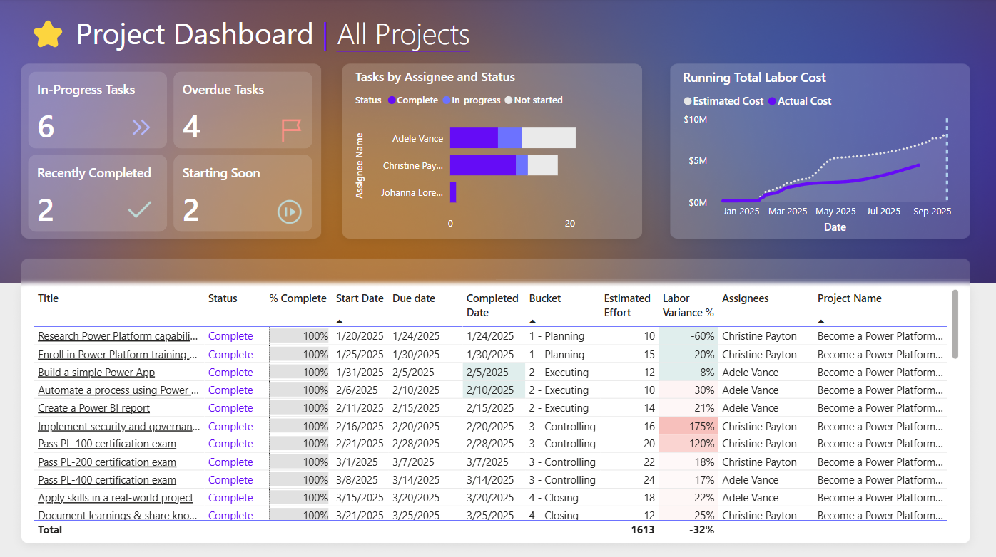
This post is an accompaniment to the video tutorial series on creating a project management dashboard on YouTube. In this video, we create measures to measure in-progress, overdue, recently completed, and starting soon tasks, then use those measures to conditionally highlight tasks in a table. We also have a cumulative sum of estimated vs actual hours in our project and a Gantt chart. Please see the full video for how to implement these! This post simply makes the formulas easier to read or copy.
The background images used in the dashboard are available here. We use icons from Google here – double arrow (color B5B8FF), check (BDD9D6), not started (BDD9D6), flag (FF9187). Colors used in the table are E0EEED for the green, F7C0BC for the red, 650CF6 for completed status, 7E83F4 for in-progress, and a medium grey for not started.
Here are the formulas used in the video:
Power Query
First we created a custom column to flag overdue items. This can be used in calculations, but also as a filter or slicer:
if ([Due date] <> null and [Status] <> "Complete" and [Due date] < DateTime.Date(DateTime.LocalNow())) then "Yes" else "No"DAX Measures
Count Tasks = COUNTROWS('Project Tasks')Count In-Progress Tasks =
CALCULATE(
[Count Tasks],
KEEPFILTERS('Project Tasks'[Status] = "In-Progress")
)Count Overdue Tasks =
CALCULATE(
[Count Tasks],
KEEPFILTERS('Project Tasks'[Overdue?] = "Yes")
)Count Recently Completed Tasks =
CALCULATE(
[Count Tasks],
KEEPFILTERS(
'Project Tasks'[Status] = "Complete" &&
'Project Tasks'[Completed Date] >= TODAY() - 7 &&
'Project Tasks'[Completed Date] <= TODAY()
))Count Starting Soon Tasks =
CALCULATE(
[Count Tasks],
KEEPFILTERS(
'Project Tasks'[Start Date] >= TODAY() &&
'Project Tasks'[Start Date] <= TODAY() + 7 &&
'Project Tasks'[Status] = "Not Started"
))Labor Variance % =
CALCULATE(
DIVIDE(
SUM('Project Tasks'[Actual Effort Hours]) - SUM('Project Tasks'[Estimated Effort Hours]),
SUM('Project Tasks'[Estimated Effort Hours])),
KEEPFILTERS('Project Tasks'[Status] = "Complete")
)These went into a modern card visual, then conditional formatting was used where if the measure result was greater than 0, the relevant field value was highlighted.
Here was the end result: